

The Death Cult of the Operational Dashboard
“Of all tyrannies, a tyranny sincerely exercised for the good of its victims may be the most oppressive.” — C.S. Lewis

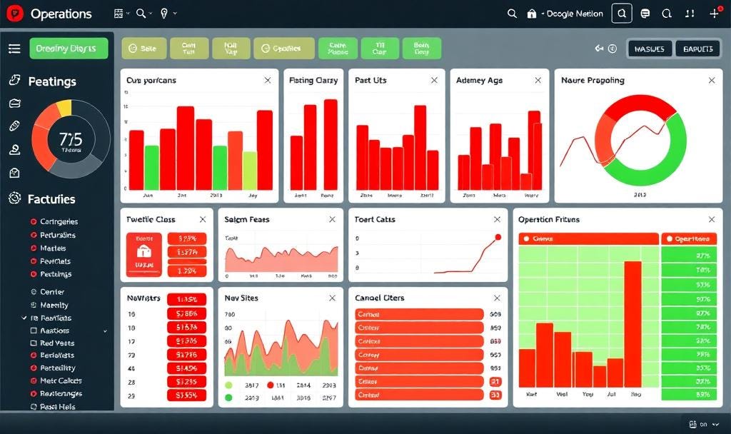
Welcome to the Monthly Site Review
There is a certain type of dread that lives in operations. It typically arrives the last week of every month and it shows up wearing a dashboard. If you’ve ever run a plant, a distribution center, or a field team, you know exactly what I’m talking about.
You already know which metric is going to be red. You already know the context won’t matter. And you already know what’s coming next. The callouts. The questions. The pressure. Not curiosity. Not investigation. Correction from a distance by people who may not have seen the site in months, if ever.
Dashboards are the delivery system for blame.
They take the uncertainty of complex systems and simply paint it red (bad) or green (good). They pretend a color can tell a story. They let someone five layers up the org chart feel like they’re informed, while those closest to the work, prepare to get jumped on with both feet for a bad number. Often, local leaders couldn’t control the result or the site isn’t properly resourced to fix it. Yet, everyone knows what’s coming, that’s the worst part. It’s predictable and almost inevitable.
If you’ve worked in operations, you know the ritual. Each site sends in its slides for the monthly performance review. A massive video call convenes, where one by one, each team takes their turn presenting the same grid of metrics, same color-coded boxes, same uneasy explanations.
You already know where your red boxes are. You’ve rehearsed your talking points. You’ve preloaded your root causes and action items. Not because you think they’ll be heard or even successful but because you know what’s coming if you don’t have them.
A VP scans the slide. Maybe it’s the first time they’ve looked at it. There’s a pause. Then the hammer drops: “Too much red. Walk me through every action plan.” Or worse: “What’s being done about this? Why isn’t it fixed?” If someone dares to explain — shares context, real-world constraints, staffing gaps, the instability of the process itself — it’s dismissed on the spot: “That sounds like an excuse.”
The entire event is a performance, and everyone knows their role. The site defends. The VP challenges. The data becomes a stand-in for truth, and anyone who questions it risks being labeled defensive or weak. What gets lost in all of it is the system: the actual operation, the human beings running it, the structural conditions driving the result.
The dashboard doesn’t just enable this disconnect. It justifies it. It gives leaders a clean, simplified interface that absolves them from asking better questions or taking responsibility for upstream decisions. It allows someone who hasn’t been to the site all quarter to interrogate the people who live inside the constraints they created.
There’s no metric on the dashboard for upstream underinvestment. No red box that lights up when senior leadership is out of touch. No data point for the wear-and-tear of being managed by a color instead of context.
And so the review ends. Feedback is given. Next steps are assigned. Everyone moves on, until the same call next month, where the same colors will flash red, and the same cycle plays out. Again. And again.
That’s what makes it exhausting and pointless. Not the review itself — but the disconnection it reveals, and the powerlessness it reinforces. Real value comes from people who talk, think, and fix together. Dashboards exist so those who don’t do any of that can still feel in charge.
It didn’t start like this.
The early days of Lean taught us to walk. The exceptional book, Learning to See documented the work inside Toyota. It asked us to go where the work is. To look, not fix. To understand systems before we judged outcomes. Leaders would walk the value stream, watch the process and talk to the people doing the work. Sense the rhythm. Spot friction. Ask real questions.
But walking takes time. And time takes priority. And so we made spreadsheets. Then trackers. Then dashboards. Each one pulled leadership a little further from the process. Each one added a layer of abstraction — and a false sense of certainty. Now, a VP who hasn’t been on-site all year can “see the operation” from their phone.
What they actually see are rectangles. Red box, green box. Perhaps a trend line if they’re lucky. That’s what often drives decisions today in operations, colors on a dashboard without context or a full understanding of causes.
The dashboard doesn’t tell you if the goal was realistic. It doesn’t show how the system is performing. It won’t show whether the number was sandbagged, inflated, guessed, or gamed. But the dashboard gives executives what they crave — immediacy.
The ability to answer questions quickly. To act with confidence, even if it’s manufactured.
So the pressure moves down. Supervisors get pulled into triage mode. Operators get yanked from root cause work to update numbers. Everyone adjusts behavior to protect the metric, not the system. And none of it makes anything better.
It just tightens the screws without improving the machine. The dashboard doesn’t serve the operator, supervisor or the process. It serves the person who’s not there.
The one who believes their “need to know” justifies your pain to deliver it.
The one who thinks urgency is leadership.
That’s the tyranny. Dashboards don’t flatten hierarchy. They harden it. They let the least involved become the most vocal. We’ve reached a point where dashboards are treated like sacred instruments. Performance rituals. Status ornaments. Tools for people to simulate involvement without doing the uncomfortable part — actually going to see.
And the scariest part is that they offer plausible clarity. Not truth. Just enough polish to keep pretending to understand something. Just enough green to believe things are under control. The further you are from the work, the more likely you are to think the dashboard is real. The closer you are to the work, the more obvious it is that it isn’t.
Dashboards aren’t evil. But the worship of them — the belief that presence is optional, that color equals context, that data equals wisdom — has cost us something essential. We don’t need to throw dashboards away. We need to stop kneeling before them.
They aren’t insight. They aren’t story. They aren’t the work. They’re a glimpse and they only mean something if you already understand what’s underneath. No amount of green boxes will fix a system you’ve stopped being curious about.